
Small Business Website Trends That Earn Enquiries
Small business website trends for 2026: faster pages, clearer journeys, useful automation and stronger proof that help turn enquiries into loyal customers.
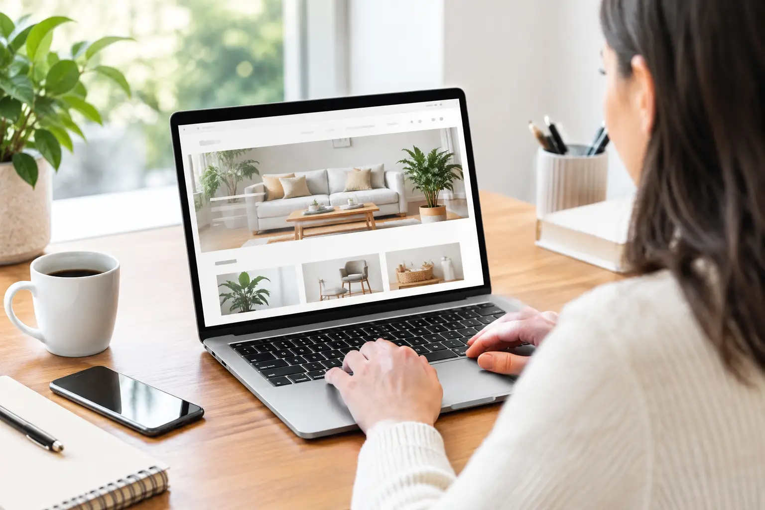
A potential customer has already made a decision before they fill in your contact form. They have checked whether your business looks credible, whether you serve their area, whether the service feels right for them, and whether getting in touch will be easy. The most useful small business website trends are not about chasing a fashionable design. They remove doubt at the exact point a customer is ready to act.
For sole traders and growing teams, that matters more than ever. A website should not sit separately from the way you quote, take bookings, answer questions and bring customers back. It should make those everyday jobs easier, while giving people confidence that they are dealing with a professional business.
Small business website trends are becoming operational
The line between a website and a business system is getting thinner. A well-built site still needs to look premium, load quickly and work properly on a mobile phone. But its value increasingly comes from what happens after someone clicks “enquire”, “book” or “request a quote”.
For a plumber, that may mean collecting the right job details before a call-back. For a beauty clinic, it may mean directing clients to the correct treatment and reducing missed appointments. For a consultant, it may mean qualifying leads before diary time is spent on conversations that go nowhere.
This does not mean every business needs a complicated portal or a long list of software subscriptions. In fact, the better trend is restraint: connect the few steps that matter, and make them work reliably. A clear website, a simple customer record, timely reminders and thoughtful follow-up will usually outperform an impressive-looking site that creates more admin.
Clearer customer journeys beat crowded homepages
Small-business websites often try to explain everything at once. A homepage becomes a wall of services, promises, testimonials, images and buttons, leaving a visitor to work out what to do next.
The stronger approach is to lead with one clear message: who you help, what you do and what the next step looks like. Someone arriving from Google should be able to understand those three things in seconds. They should not need to decode industry language or hunt for a phone number.
Give each service a proper place
Dedicated service pages are becoming more valuable than generic “what we do” sections. They allow a business to explain a specific problem, show relevant proof and answer the practical questions that slow down enquiries. A domestic electrician might cover emergency call-outs, landlord certificates and full rewires separately. Each page can then speak to a different customer need without making the homepage feel overloaded.
This also makes a site more useful for local search. Search engines are better at understanding focused pages with genuine detail than broad pages stuffed with place names and repeated phrases. Write for the customer first: what is included, where you work, what happens next and how quickly you can respond.
Reduce the effort required to enquire
Long forms are not always a sign of professionalism. If a customer needs a simple answer, asking for ten fields can turn a warm lead into a lost one. Start with the information you genuinely need, then gather more detail when it helps move the job forward.
For businesses with frequent questions or time-sensitive leads, conversational contact options are growing in importance. A well-configured WhatsApp receptionist or enquiry flow can acknowledge messages, capture key details and set expectations outside working hours. The aim is not to pretend a bot is a person. It is to make sure a prospective customer is not left wondering whether anyone has seen their message.
Proof is becoming more specific
Generic claims such as “quality service” and “customer focused” have little weight on their own. People expect businesses to say good things about themselves. They trust evidence that feels close to their own situation.
That is why detailed reviews, before-and-after project photos, case studies and recognisable local work are so effective. A five-star review is helpful; a review that explains how quickly a leaking boiler was fixed, or how calmly a nervous client was looked after, is far more persuasive.
Place this proof where a decision is being made, not only on a separate testimonials page. A treatment page should show treatment-specific feedback. A commercial cleaning page should demonstrate experience with similar premises. For a trades business, photographs should show finished work clearly, with short captions explaining the job.
Review management is part of this trend too. Asking every happy customer at the right moment creates a steadier flow of fresh feedback than sending an occasional blanket request. Private feedback capture also gives a business a chance to resolve a poor experience directly before it becomes a public complaint. That is not about hiding criticism. It is about responding properly while the issue can still be put right.
Faster, calmer design is gaining ground
Premium no longer means dramatic animations, oversized video banners or complicated effects. For a small business, premium usually means considered: clear type, confident spacing, original imagery, useful content and a site that responds quickly.
Mobile performance is especially important because many enquiries happen between jobs, on lunch breaks or while someone is standing in a kitchen with a problem that needs sorting. If pages jump around while loading, buttons are too close together or the booking form is awkward on a mobile phone, the polished desktop version will not save the experience.
There is a trade-off. Visual personality matters, particularly in hospitality, beauty, retail and creative services. But it should support clarity rather than get in its way. Use movement sparingly, make text easy to read and ensure the next action is always obvious. A calmer site often feels more established because it does not need to shout.
First-party customer data matters more than follower counts
Social platforms can introduce people to your business, but they are rented space. Algorithms change, accounts can be restricted and a strong post does not automatically create a useful customer record.
Your website should give customers a reason to deal with you directly. That could be a booking enquiry, quote request, callback form, event registration or product enquiry. Once someone has made contact, the business should be able to see their request, respond promptly and follow up without copying information between inboxes, notebooks and separate apps.
A simple CRM or dashboard is increasingly valuable here, not because small businesses need corporate technology, but because memory is not a process. When customer details, appointment status, notes and next actions are held in one place, fewer leads are forgotten and service becomes more consistent.
Automation works best when it handles predictable moments: an acknowledgement after an enquiry, an appointment reminder, a request for a review after work is complete, or a rebooking prompt when a regular service is due. It should never make communication cold or relentless. A customer who has already cancelled, complained or booked elsewhere should not receive an irrelevant automated nudge.
Accessibility and trust are practical priorities
Accessible design is not a decorative extra. Clear contrast, readable font sizes, descriptive buttons and forms that work with a keyboard improve the experience for everyone. They also reduce friction for customers using a mobile phone in bright daylight, people with temporary injuries and anyone who simply wants to complete a task quickly.
Trust is built through smaller details as well. Show a real business address or service area where appropriate. Make pricing guidance clear when it is possible to do so. Explain what happens after an enquiry. Keep privacy information easy to find, and avoid stock photos that make a local business look anonymous.
For regulated or sensitive services, credibility may also depend on qualifications, insurance, accreditations and clear boundaries around what you can help with. The right information varies by sector, but the principle is consistent: answer the reasonable worries a customer has before they need to ask.
Build for the repeat customer, not only the first enquiry
A website is often measured by new leads, yet many small businesses grow through repeat work and referrals. The most valuable website trend may be the least visible: designing the journey beyond the initial sale.
After a booking or completed job, the next step should be deliberate. A salon client may need a rebooking reminder at the right interval. A home-services customer may benefit from an annual maintenance prompt. A professional service business might send a useful check-in when circumstances are likely to have changed. EKKO Loop® is built around this kind of practical lifecycle, connecting the customer moments that are otherwise easy to miss when business gets busy.
Not every business needs the same sequence. A one-off renovation firm should not send monthly offers, while a barber or fitness coach may benefit from regular, friendly reminders. The right frequency depends on the service, the customer relationship and the value of the next visit.
The strongest website is not the one with the most features. It is the one that makes a customer feel confident enough to take the next step, then makes it easier for your business to keep its word. Start with the points where enquiries currently stall or customers drift away, and improve those first. Nothing more is needed until it is.
Need this built for your business?
EKKO builds affordable websites, custom CRMs and automated follow-up systems for small businesses, sole traders and startups. Contact us for a custom quote.
More from the EKKO Journal
Small Business Automation Trends That Pay Off
Small business automation trends are moving beyond flashy tools towards practical systems for enquiries, bookings, follow-ups, reviews and repeat trade.
Spreadsheets Versus CRM Workflows: When to Switch
Spreadsheets versus CRM workflows: learn when a spreadsheet is enough, where it creates risk, and how tailored systems save time for busy small firms.
Essential Features for Trades Websites That Win Work
Essential features for trades websites that turn urgent searches into enquiries, show proof of quality and keep customers informed from enquiry to review.